
Technology is capable of truly amazing things. But without paying attention to the user interface design (UI), it doesn’t matter how clever or groundbreaking or revolutionary your tech product is.
If it’s not simple and straightforward for people to use, even if it feels a bit ‘clunky’ or visually isn’t up to much, people will use once and then quickly pass.
That’s what makes UI design so important for any technology. It’s not just what tech can do, it’s how it does it. Or rather, how the user does it. According to Forrester, investments in UI / UX (user experience design) have been shown to produce returns of up to 9,900%. That’s £100 for every £1 spent.
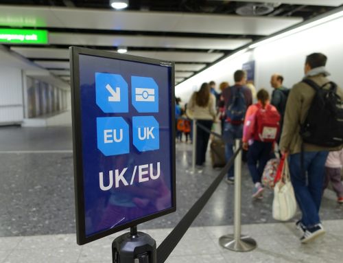
UX has always been a strong point for self-service kiosks. Indeed, with their user-friendly touchscreen interface, you could argue that UI design has been integral to the rise and rise of kiosks. Self-service itself isn’t what does it for people. It’s self-service made easy.
What makes a good kiosk UI?
So what makes for a good kiosk interface? We’ve already mentioned the role touchscreens play, which are intuitive and low-friction in their own right. They are also familiar – most people own a smartphone these days, so they are used to touchscreen controls.
And while touchscreen devices rely on graphic UIs the same way, say, a PC with a mouse and keyboard does, there’s something more direct about a touchscreen. If anything, it encourages greater use of graphics and images, things you can literally reach out and touch.
That still means you have to get the graphic design of the software right, which is a key part of UI design for any device with a screen. There’s a tendency with GUI to go all-in trying to create a ‘wow’ factor, as if the primary purpose of visual design is to grab attention. It isn’t. Users want everything to be clear, simple and, above all, quick, not a work of art. All too often, graphic UI designs that try to be too clever end up coming across as cluttered.
It’s also important to remember that your kiosk will be used by a wide range of users. UI design should always put accessibility right to the fore, and ensure that it delivers an intuitive, straightforward experience for everyone. That means designing for people with different physical abilities in mind, different levels of aptitude with technology and so on.
Similar principles apply to choosing your hardware, too. The size and set up of your kiosk will in part be determined by location and what its purpose is. But you should also factor in your users. For example, it might make sense in small spaces to have small screens. But if that then means smaller text and icons, making life awkward for visually impaired users (and perhaps everyone else), any space-saving benefits are cancelled. Usability should trump all.
Ultimately, business owners know that prioritising the needs of their customers is integral to achieving their business goals. It’s that very same principle that determines why UI is so important on kiosks. Simply by deploying kiosks, you have some sort of business objective in mind, likely raising customer satisfaction, boosting operational efficiency and customer throughput, and increasing revenue. All of those things depend on people enjoying using the kiosks and coming back for more.
Interested in finding out more about kiosk UI design? Get in touch with our team today.